When my husband and I bought our home on the North Fork during the summer of 2015, someone had given us the advice to sit with the house for some time before deciding on paint colors, that way we’d have a better feel for the space and how the light hits the walls. Sound advice for most became over two months of countless trips to our local paint stores and non-stop indecisiveness on my part. Did you know there are hundreds of shades of white? The names of nearly half of them are seared into my memory… White Dove, Creamy, Bohemian Lace, Super White, Decorator’s White, Linen White, and the list goes on.
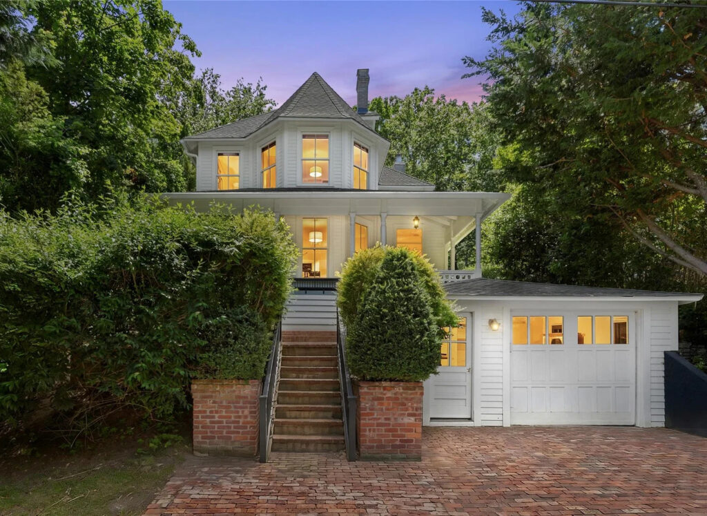
I can easily recall the October morning that the painters arrived. Early. It was the day that we overslept, pre-kids, of course. (Because oversleeping doesn’t happen once kids happen.) Out exploring our new town with new friends, we stayed up much too late. We paid for it as the painters rang the doorbell at 7:30 a.m. in their whites with buckets, rollers and ladders in hand ready to get to work. The “we’ll do it in the morning” became a pre-coffee rush to get all our haphazardly placed, half-unpacked boxes pushed into the centers of each room so the magic of paint could transform the walls around them. And then it was time for the painters to prep the staircase. The design choice was a decision that I had agonized over for months. We studied the photos of the staircase — a focal point that can be seen from nearly every room on the first floor — which we took during walkthroughs and visits to our soon-to-be home wondering the best approach to make it ours. Black was the decision, but it wasn’t an easy one. “What if we hate it? It will show every mark. It’s one of the first things people see when they enter our home… Black? Really, black!?” consumed my thoughts. But we committed to it and, as the painters opened gallons of “Bohemian Black,” my anxiety was through the roof. Did we make the right choice? Nonetheless, out the door we went knowing that when we arrived back home at the end of the day our house would be transformed into our home with this first stamp of “us.” Early that evening we opened the front door and were greeted by our stunning black staircase. It was at that moment that I knew trusting my gut would be the only way to go as we designed every corner of our home filling it with the old and new.
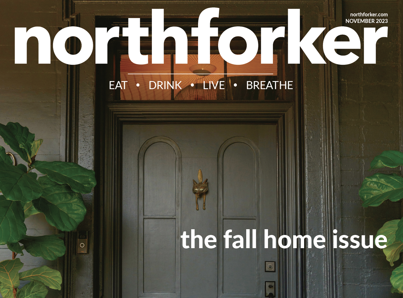
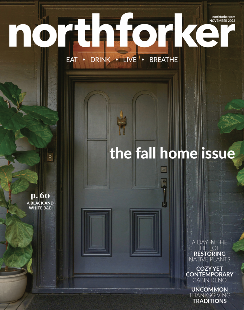
Fast-forward to 2022, we watched once again the power of paint but this time it was from afar. (Phew!) The transformation of what is now Vine+Sand, the renovated farmhouse that sits on Main Road in Southold and serves as a B&B, went from a subtle yellow to a striking black. The color story intrigued us and begged us to want to know more. Luckily, in this Home issue, we get an insider look into the newly renovated rooms and reasons behind the drastic design of an over 200-year-old home.
There is a common thread in many of the stories within our Fall Home issue that I wish I could say was predetermined. Making something yours, whether it be with paint or renovation, takes an appreciation for what was and a thoughtful plan for what will be.
The top-to-bottom rehab of a 19th-century Southold cabin, shows exactly that as interior designer Emma Montgomery considered the original spaces of the home and breathed new life into them creating a home that feels intentionally “comfy, cozy” as we like to say in our family.
And then there’s the story of Thanksgiving. No, not the actual one, but ours where we talked with local chefs and farmers about the ways that they’ve made the holiday theirs and what that means to them. For some, it’s a passed down tradition with a twist, for others it’s a whole new take.
I hope that as you embark on embossing your own personal stamps in your life and in your home, you feel inspired by the stories in this issue to trust your gut and take the leap. I can’t wait to see the beauty you create.